Inspirations Behind Decade
Alpha Centauri
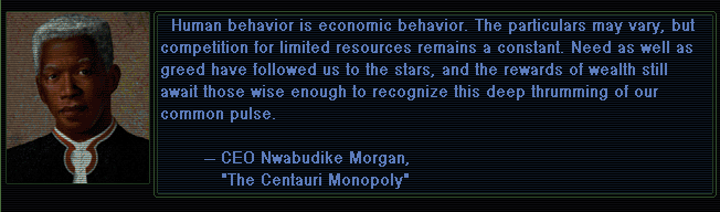
Alpha Centauri was the game I was playing when I came up with the idea for Decade. I've played it every few years since it came out (but I'm still rubbish at it). I wanted a similar top-down world map (later changed to timeline). I figured such a game would be easier to make since I wouldn't have to worry about physics, level design, or creating lots of art.

The buttons were the first thing I properly tried to design in Decade. After looking at a lot of designs online and hating them all, I just copied Alpha Centauri's designs and never changed them (call it an 'homage').

The biggest thing I stole was the tone of the writing. Alpha Centauri does a lot with very little, and its vibe is the reason I keep going back to it. It's quite hard to talk about big ideas in a vivid and succinct way. AC does it with a very matter-of-fact, sincere, and drily humourous tone. Once I tried writing like that, a lot of Decade's story and visual style developed naturally from it.
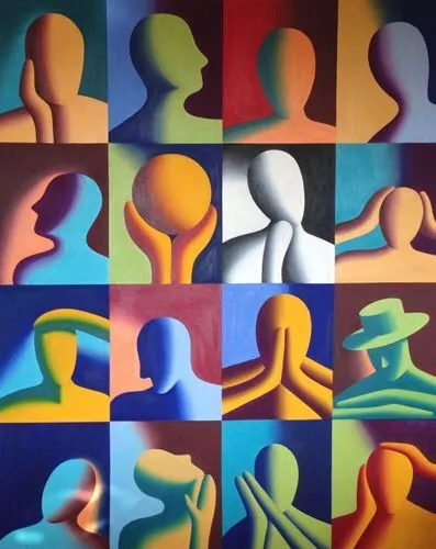
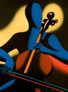
Mark Kostabi
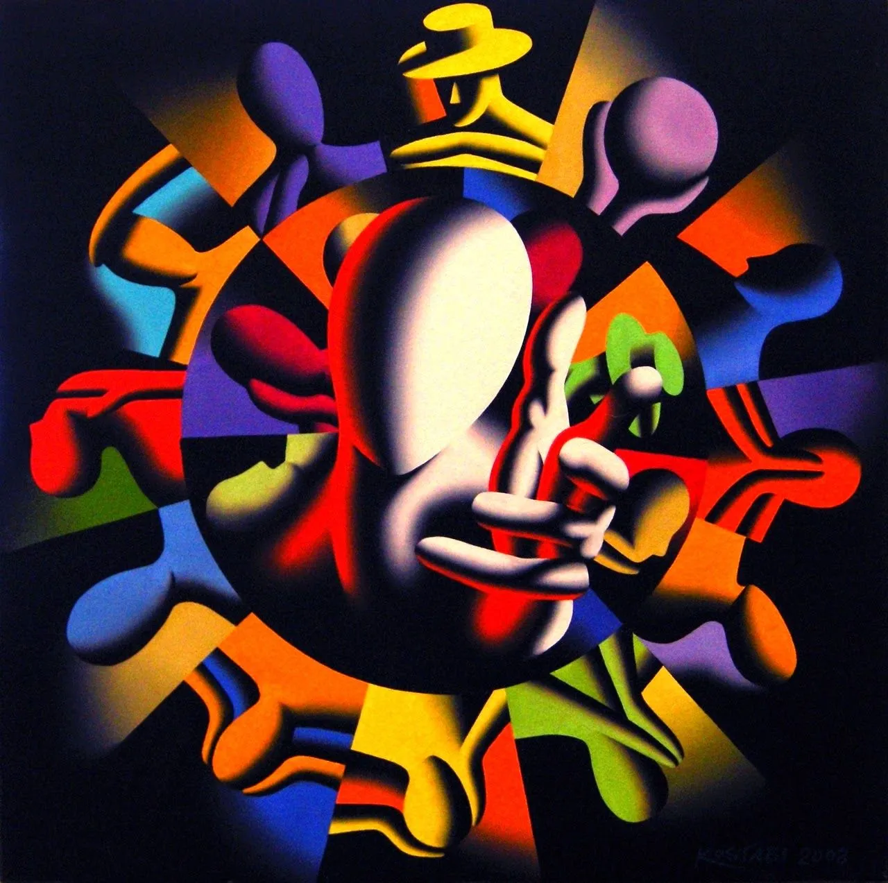
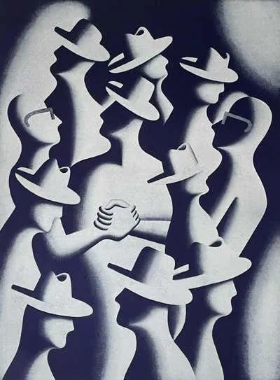
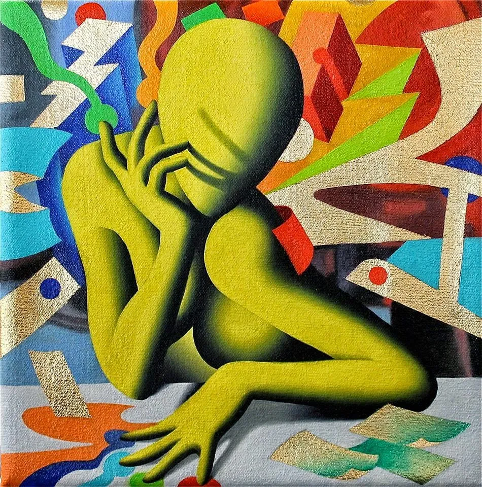
Mark Kostabi is a 90s artist who is maligned as a grifter now (though I think he's popular in Italy). I remember coming across his stuff sometimes as a kid, and loving the cozy, weird, fantastical world it seemed to depict. His paintings can sometimes be very twee and goofy (another reason 'critics' disliked him) but they have always felt inviting to me.
Making art for Decade forced me to look at his paintings in a new way — I wanted to decipher what, exactly, I liked about them. I realised that the colours were a big part of it — it's a palette you don't see often. Deep purples, royal blues, muted yellows, always contrasted against black. Also, a lot of gradients with noise on them. My attempt to emulate these things formed a lot of the look of Decade (certainly the 'Default' theme).
David Carson
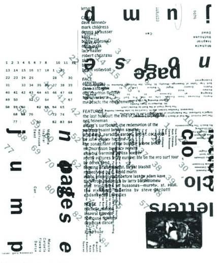
David Carson was a graphic designer from the 90s (also maligned now, though I don't know why). He created layouts with images and text. The images are often blurry and indistinct, the text usually unreadable, cut-up, or aligned badly. Everything was subservient to some grander logic of the layout — which usually has a kind of movement, something that draws the eye around it in a pleasing way.

Decade needed a short cutscene sort-of-thing to 'break' the flow of gameplay whenever you made a decision, to make it feel more dramatic and important. I tried a regular cutscene but it grew repetitive quickly. I used Carson as inspiration to make small randomised transitions, composed of text and images the player has most recently engaged with. I was cheating in a way — Carson creates movement from static things, while I could just program it in.
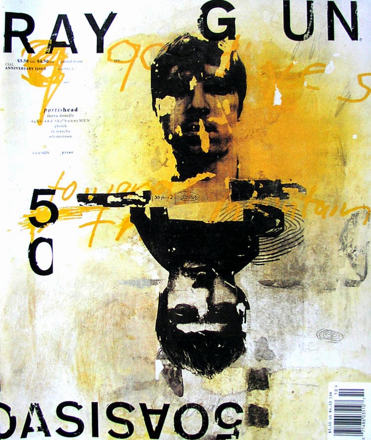
By being random and somewhat recognisable, it felt more 'alive' than a repeated cutscene, but didn't need a lot of handmade work still. I'm proud of the idea, and it's something that I think could have been even better if I had a lot of time. A system like this could be tuned, I found, to create certain effects. Things popping up but sharing x-axis or y-axis often created a sense of order to the chaos. Having random things animate behind or in front of other things could create a lot of surprisingly natural depth. Little things that I think could be used really nicely. I hope someone else steals this idea.
As an aside, Carson-type design feels very relevant and important to me today. There is something perverse about a Twitter feed including cat pics, dead children, promotional ads, a random non-sequitur from your cousin, football transfer news, and a long essay about sexual relations all in the same feed. All perfectly aligned, occupying the same space, in the same font, according to the same rules. It's perverse. Design like Carson's is a truer, and more humane, representation of the chaos the internet brings to one mind.
Reading History
I've always read a lot about psychology, culture, design, economics, and of course, lots of fiction — but I always avoided history. It seemed boring. When I started reading about history in my thirties I discovered that it was, in fact, not a dull list of dates, but the most vivid example of all these things.
Here are just a few books and series I've liked so far:
- Sexual Personae
- Against The Grain
- The Fatal Shore
- King Philip
- Empire of the Summer Moon
- Lives of the Artists
- Devil in Massachusetts
- Genghis Khan and the Making of the Modern World
- The Rise and Fall of Athens
- The Twelve Caesars
- Q (historical fiction)
- This is Civilisation (Documentary series)
- I, Claudius (historical fiction drama)
I've been picking periods and reading multiple books on them (so far a lot of American and Roman history). Next, I want to read more about British history and the Thirty Years' War.
Photoshop And After Effects
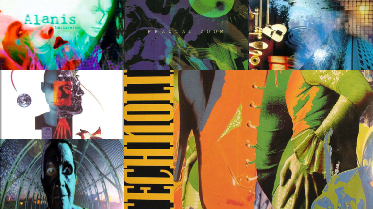
I strongly believe that the tools one uses affects what one creates. This is obvious when you think about the difference between a song composed on guitar and one composed on a MiniMoog synth. Engines like Unity make creating an environment a simple matter of placing and moving objects around. It's no coincidence, I think, that many devs now create simulation games which involve the player placing and moving objects around.
Photoshop is a 90s program, and I was already in a 90s-inspired frame of mind with the game. When I started learning it I recognised immediately how so many 90s album covers and such were really just an excitable and basic use of this new technology. Since I, too, was new to Photoshop, I also abused its filters and effects in a fairly simple and over-eager way.
After Effects was a similar story. These days, both these programs are used in very 'tasteful' and 'subtle' ways. I wanted the most striking effects despite my limited talents, and ended up in the same place amateur video-makers in the 90s found themselves.
Inspired By What I Hate
When I showed an early version of the game to a couple of mates, they said 'you've got something, but it looks like shit'. I asked them what UI they thought looked good. They said God of War, or Ghost of Tsushima (these are the kind of games they play). I checked these games, and I thought their UIs were horrific.
Making art that is good or bad is one thing — but the values contained within art is a different issue. I don't care that I'm not a professional artist or designer, I can talk about values here. This is the aesthetic of our time. Black on white. Everything tastefully, precisely, aligned. Flat design. Minimalist. 'Clean'. It's the design of all our apps, all our websites. Apple adverts. The most aspirational and influential company of our time. Arial font. Black rim glasses. Black polo neck. Bauhaus Germans smiling at us from heaven. Everyone who worked on this is more talented and smarter than me — but I don't need all that when I have instinct, and my instinct finds this philosophy of design repellent.
What does it mean? What does this design tell us about ourselves and our world? This absence of colour, of shape, of texture? Is it purity? Is that what we all want? Is it that we want to see things that aren't as messy and chaotic as we are? I'll tell you what I see: Cowardice and fear. Terror at the notion we might see or reveal some secret, something textured and flawed and perhaps human. It is a Faustian bargain with mediocrity: I won't try to make something great as long as I can guarantee nobody can call it bad.
Perhaps this is understandable in a world full of cameras. I'm old enough to remember when Myspace — that slow-loading site where each profile was an expressive, personally-curated, melange of animated gifs and inscrutable fonts — was replaced by Facebook, which reduced everybody to a resume and looked like a database of government forms. Maybe I'm just nostalgic, but a lot of the kids agree, with their PS1-style grimy-texture games and Geocities revivals. I hope they realise what's going on.
Nathan Tardiff And Noodler's Ink
There is a man in Massachusetts called Nathan Tardif who single-handedly runs a company called Noodler's Ink — where he makes a wide variety of inks for fountain pens and other such things. Around 2014 I started using fountain pens to write in order to get away from the screen and because the medium is the message. I gravitated towards Noodler's stuff because it was cheaper than others, while being so obviously, tangibly better.
Nathan Tardif is a lover of history — mainly American, but he has the history-lover's respect for other cultures. The names and labels of his ink are dedicated to many events and people of the past: T.E. Lawrence, Qin Shi Huang, Native American tribes, the Manhattan Project, and Russian composers. A lot of the inks are also inspired by wildlife, and a lot are also political, or rather, economy-related. He believes in the principles of Ford-style capitalism (produce something cheap, good, and durable), is against the idea of debt-based currency inflation (he made ink labels that criticised Bernanke), and free speech (many of his inks were deliberately provocative). Many people hated him for this, and eventually slandered him enough that cowardly retailers pulled his products until he apologised, donated to the ADL, changed several of his most wonderful ink labels, and disappeared from the internet.
I was fascinated by Nathan Tardif for a long time, gathering all the information I could on him in order to write a semi-biographical story (in the style of American classics like Citizen Kane or The Great Gatsby). I saw a lot that was exciting and insightful in the story of a man inspired by the past to achieve something incredible, and create inks which would last forever, so the present may be recorded for the future. An understanding that time is bigger than all of us, that we merely inherit it for a while and pass it on.
The book project grew too ambitious, and I held it to such a high standard that I scrapped most of my attempts, but I wanted to offer at least some mention towards Nathan Tardif in the game. Especially since it was probably staring at the bottle of Rome Burning on my desk that finally got me curious enough to start reading about history in the first place.
